

A New Dawn...Dulux have announced their Colour Of The Year for 2020 and it's a winner!
The Dulux Colour Of The Year for 2020 has been announced and it’s a colour that I’ve been banging on about for months. Tranquil Dawn is a soft muted sagey mint green…rather like the colour of our bedroom as a matter of fact #aheadofthecurve

Our bedroom painted in Farrow & Ball’s Cromarty
Each year the colour is selected by an expert panel of colour designers, trend forecasters, architects and editors from around the world. Last year it was Spiced Honey, a warm, deep, caramelly beige (liked it) and the year before that it was Heartwood, a drab kind of heather shade (didn’t like it). This year’s soft green hue is a nod to our need to reconnect with nature in a digital world.

Image via Dulux
I can vouch for the calming green shade. I always head to our bedroom when I want to chill out and I love waking up in here. Our room is painted in Cromarty (Farrow & Ball) but it’s a similarly soft muted green, somewhere between mint and sage. I’ve paired it with teal and pink in our bedroom, but I also love it with lilac for a super modern look.
Used in kitchens this shade is a nice alternative to white, ideal if you’re looking for something fresh and modern, like this inspiration shot from Dulux.
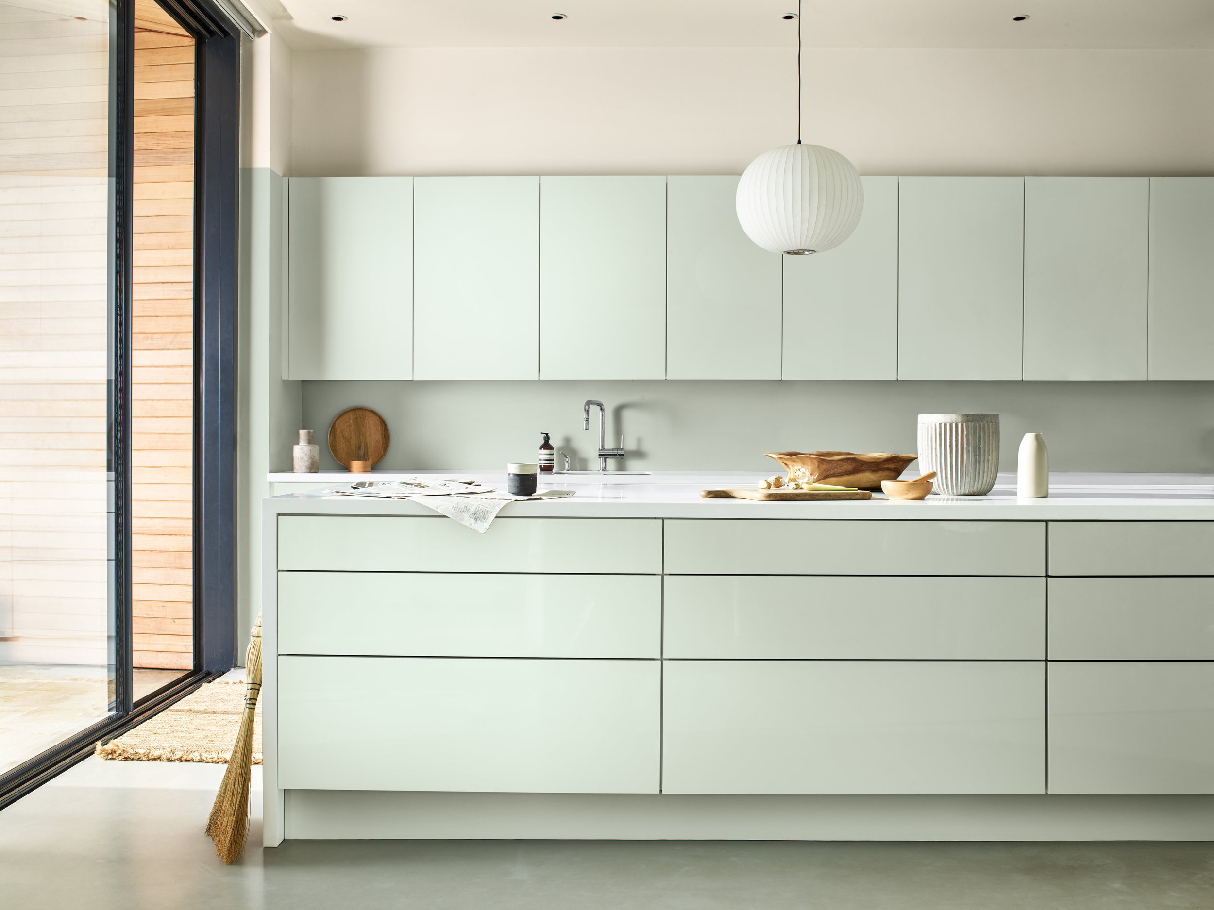
Image via Dulux
Personally I’m very drawn to the colour in bathrooms (see some of my inspo shots below). I have literally just finished the design for our guest bedroom and en suite and this green shade currently features very heavily, though I have to admit I am now having a bit of a wobble about it because I am worried everyone will be doing it. However I do love the design, so I’ll have to think on it for a few more days before I commit. Watch this space…
In the meantime, I’ve been meaning to do a blogpost about this colour for a while now, so when this was announced today I thought it was the perfect time to share some of my favourite sage and minty green inspiration, as it might inspire you too. I’ve also put together a quick shopping edit featuring some of my favourite pieces in these shades on the high street right now, if you want to get in on the trend yourself.

Image via Jotun
I love this example of muted sage green, teamed with shades of beige and off white. It feels elegant and timeless, yet also modern.
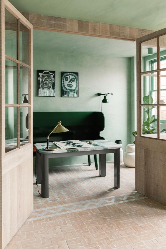
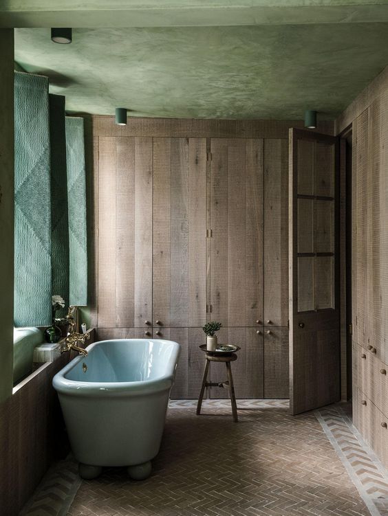
One of my all-time favourite design projects is the Beldi house by Chan & Eayrs architects. The whole project is saturated in this muted minty green from the beautifully textured lime plaster walls, to the kitchen tiles and even the bath! Granted, all of these things together are not very achievable, but as a standalone example of design, I just love it. And you can always take inspiration from these projects in small ways too, whether it be tiles or lime plaster walls.

Image via Tim Labenda
Well hello there! All the heart eyes for Tim Labenda’s bedroom. Clever and economical use of that Gucci wallpaper…it costs an arm and a leg but has major impact. You don’t need to cover the whole wall, and I’d argue it’s even more impactful when used as a backdrop to the bed. There isn’t a thing in this set-up I don’t love.

Image via Retrovious
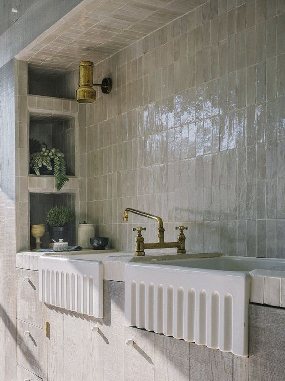
I can’t stop looking at this shower enclosure. Seriously I keep coming back to this image on Pinterest over and over again. It’s super simple but these Zellige tiles are so beautiful, I just want to dive in.

Image via Studio Pepe
I am yet to have the opportunity to go to Salone in Milan but I always watch the Stories of people who do go very closely to see whats going on and whats going to be big in interiors. One of my favourite design studios is Studio Pepe and every year at Milan they have a big instalment showcasing their work. This was their secret members venue Club Unseen in 2018 and I saved this image because of the use of this lovely pale mint hue…and all the curves. Fast forward 18 months and of course both these things are huge interiors trends.

Most of the time you see shades of mint and sage paired with whites or pinks but here is an example of how it can be used with darker shades too. Paired with pink this bed would have looked cute but kitschy, but with this dark grey it looks moody, chic and sophisticated.
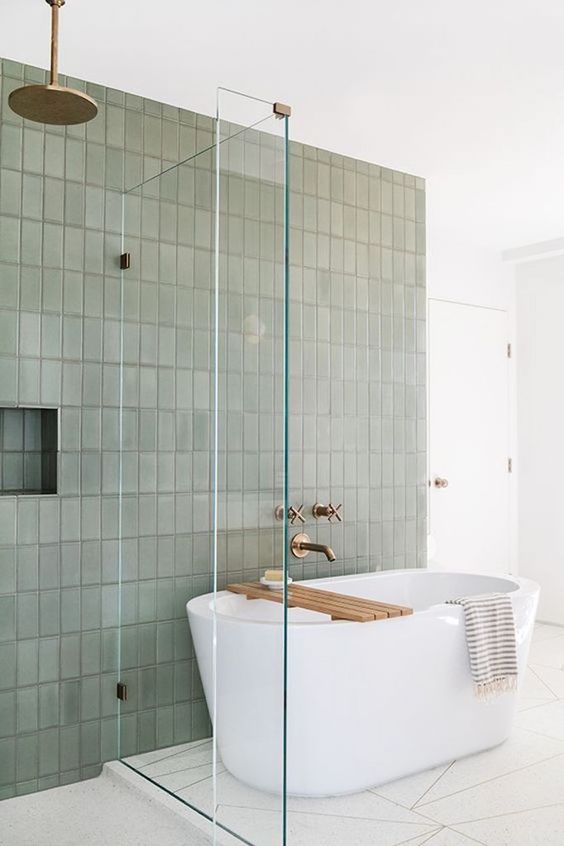
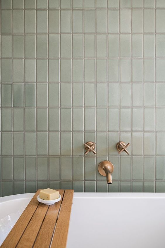
Last but by no means least is this bathroom designed by the brilliant Sarah Sherman Samuel for actress Mandy Moore. Sage green tiles, paired with crisp white and burnished brass taps. Simple but very effective. And yes to vertically set tiles.

Bed, Made.com
Tiles, London Encaustic
Cushion, Habitat
Side table, West Elm
Planter, Made.com
Tableware, La Redoute
Sink, Kast Concrete Basins
Water bottle, HAY Design
Serving Dish, H&M Home
Armchair, John Lewis
Bedding, Antipodream
Thanks for reading, Jess x


