

Colour crash course...Everything you ever needed to know about choosing paint and colour
Last week I talked a bit on Instagram about the marvellous women who I've met through those little squares since launching the blog. Interior Designer Emilie Fournet is one of those women. We haven't actually met in person yet but I'm sure it won't be long before we do. It's a funny old place Instagram. We first got chatting after Emilie commented on one of my Insta-Stories about astro-turfing our garden. She has a wicked sense of humour and has been known to make me laugh out loud. But funny lady aside, she is also a very talented Interior Designer and a total colour whizz.

Emilie in her happy place, Le Jardin Majorelle in Marrakech
I've talked before about my obsession with finding the perfect paint colour and how I've been known to spend a small fortune on paint samples before honing in on the perfect colour. I'm pretty confident with using colours right across the spectrum but I get fixated on finding the one. Other people I know see a room they like and choose their colour based on that...which is a lot easier and quicker than my approach but is also much more likely to end in a disaster. There's so much choice out there now and what works in that dream room you saw on Pinterest, could look completely different in your own home. So I thought it would be useful (for me and for you) for Emilie to give us a crash course in everything you ever needed to know about choosing paint colours and what to do with them. By following Emilie's advice I reckon I can reduce my sample pot expenditure by at least half. So before you head down to your local paint shop, stop and read this first.
Colour crash course with Emilie Fournet
Hi Emilie! What is the first thing to think about when you're about to start searching for a paint colour for a specific room?
The first thing you should do is to work out the room orientation, whether it’s north, south, east or west facing. This will impact massively on what type of natural light you will (or will not) get throughout the day. An east facing room, for example, will only get sunlight in the mornings and it will be a cool blue light so blue or green hues will work well. If you want to make an East facing room warmer, go for a colour with warmer undertones, like a green with brown undertones for example. In general, you can avoid light, white or grey-based colours in North facing rooms. Don’t fight the darkness, instead embrace it! Choosing mid or darker tones will make the room cosier and warmer. If you’re lucky enough to have a big and south /west facing room, anything goes!
The size of the room should also be taken into consideration...Myth buster number 1: Painting a small room white will not make it bigger and it will not double its size by magic. If you have a small room, go for something that will detract from its size, this could be introducing an interesting wallpaper or choosing a bolder colour. Simplify the overall feel of a small room by choosing 1 or 2 colours max for your overall colour scheme. This will give the eye a chance to relax and enjoy the space.
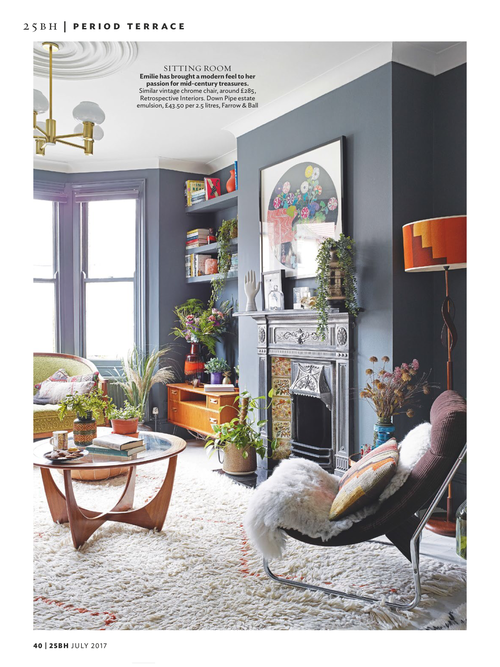
Emilie's living room as recently featured in 25 Beautiful Homes
So, I've gone and spent the equivalent of a weeks wages on paint samples, do I just slap it on?
Ha! In short, no. Depending on how committed you are to painting a room, either paint directly on the wall or, if you’re not committed, on a thick card board, which you can then tack or prop up to the wall. Try to do it in squares and as big as possible (at least 50 x 50cm but the bigger the better!). Make sure you do at least two coats, preferably 3 (as you won’t have applied an undercoat) to get the true colour coming through. Remember to wait for each coat to dry before you do another coat.
Make sure you repeat the same colour sample on all walls of the room (sample next to windows, opposite wall to windows etc..) as your colour will be affected by the light and look different in different areas of the room. This is the best way to avoid any surprises. You will also get a much better idea of how the colour will work overall in the room. Also, label each colour on each wall, it can get really confusing if you don’t! And look at it at different times of the day, natural day light will affect the colour.
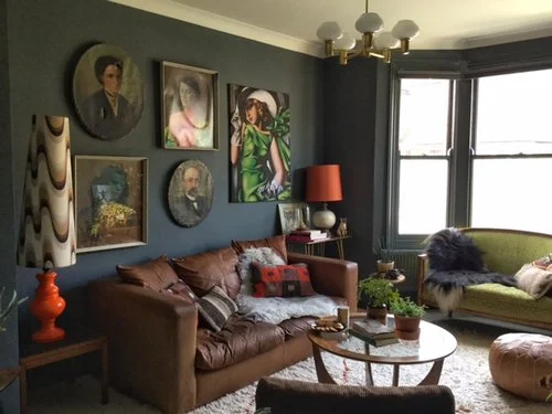
More of Emilie's living room...see how the colour has changed according to the light?
What is the most common mistake made when choosing a paint colour?
It’s really quite important that you actually try out a painted sample in the room before you commit to a paint colour. Don’t base your decision on a colour you’ve seen on photo in a magazine or on a tiny square on a sample card. What might work in one room can look disastrous in another. Apart from not sampling, make sure you choose a colour that will work with the furniture and furnishing you will have in the room and make sure you take into account your flooring as any mismatch can set off a whole room the wrong way.
Many people are scared by colour and even though they might love a darker or bolder colour in theory, they don’t dare to actually paint a room with it. Most often you will regret not going for the colour you really loved for fear of it being “too much”. It’s only paint, go for it! Don’t over-think it. Trust your instincts.
I say, amen to that Emilie!
Equally, if you really can’t make your mind up or don’t want to have to go through the soul wrenching experience of choosing a colour scheme, don’t be afraid to get the help of an Interior Designer. Most IDs will offer colour consultancy and can do a whole house in less than two hours. It can save you time (less agonising and arguing with partners over the cursed colour chart), money (less sample pots) and might open your eyes to options you hadn’t even thought of.

Clever use of paint colours in one of Emilie's residential projects
I get asked a lot by people, if it's really worth going for premium brand paints like Farrow and Ball, Little Greene etc or whether they should just get it colour matched...what are your thoughts on this?
I’m running the risk of being called a paint snob here but…yes, it definitely pays to go premium. The reason why premium paints are more expensive is because they use more and higher quality resin (which will give a better coverage) and pigments (which will give a better and deeper colour). Hence, why…Myth buster number 2: colour matching never works. You will always get a different paint formula and it will never quite colour match to the real deal. It’s such a shame to go through decorating a whole room and then choose a poor quality paint. You will end up using more to cover properly, which is a false economy and gets mixed results. After all, the most visible and largest part of a room is its walls so it’s very important to get that right.
Any premium recommendations beyond the more well known Farrow and Ball and Little Greene?
I use F&B, Mylands, Sanderson, Zoffany, Paint & Paper Library, Fired Earth, Earthborn, Ressource Peintures, Hicks & Weatherburn, Bauwerk Colours, Bert & May, Designers Guild…there are so many paints to choose from nowadays…we’re really spoilt for choice. It’s good to expand your search as you will have more options to choose from but always sample first and make sure you are happy with the paint quality.

Bert & May's Iris
So I've finally chosen my wall colour. But what about the skirtings? And the ceilings? Should I paint them all out the same colour?
It completely depends what you’re trying to achieve with the look of room. I love breaking away from the more traditional white ceiling/white skirting, especially when working with less neutral colours. I’m a big fan of painting the skirting boards the same colour as the walls; I find it works well in both contemporary settings (skirting boards are never really visually attractive in modern properties so it helps to blend them in better) or in period properties (it will make ceilings look higher and create a less distracting backdrop).
Painted ceilings are great if you’re trying to bring attention to elaborate ceiling coving for example (the coving would have to be a different colour than the ceiling and walls). Or if you have a very small room like a cloakroom with very low ceiling, painting the ceiling same colour as the walls makes the ceiling disappear, as there is no contrast between the top of your wall and the ceiling.
If you want to keep it white on the ceilings, try to avoid any abrupt contrast and soften it up by using a white that will complement your wall colour, especially if your using a darker colour. For example if you’re having dark blue walls, try to use a white that will have blue or grey undertones, it gives the room a better flow and less of a steep contrast.

Painted ceilings in a small bedroom - Image via Lonny magazine
Eggshell, Satinwood or Gloss on woodwork?
Same as above really, it depends what look you’re trying to achieve. You can use finishes in the same way you use colours to enhance or blend in architectural elements. Gloss skirting boards can look amazing and very dramatic when used with busy or bold wallpaper. I have used gloss paint on built-in bookcases to add an element of luxury in a small office and it worked brilliantly.
Also think about the practicalities, Matt finishes tend to be less durable (although eggshell is pretty hard-wearing really) but for high usage woodwork (like kitchen cabinets or skirting in entrance halls) you might want to consider Satinwood if you don’t mind more sheen.
How about choosing a colour for the woodwork if you are going to paint it a colour other than brilliant white? I sometimes find that harder than choosing the main colour!
You’re right, it can be tricky and I think that’s why most people would rather not have to think about it and go for a brilliant white to paint their ceilings and woodwork. However…myth buster number 3; white ceilings and woodwork don’t always work and can actually be quite restricting for the overall look you’re trying to achieve.
If you have a smaller space, you might want to consider painting your woodwork darker than your walls, it will create an impression of lighter walls as the largest surface will be the lightest.
Which are your own personal current favourite paint colours?
Ask me every week and you’ll get different colours. This week I’m obsessed with Dead Salmon by Farrow &Ball, Eggplant by Sanderson, Knightsbridge by Little Greene, Threadneedle by Mylands and Teal by Paint and Paper Library. Come back next week and you can have another selection ;-)

Walls painted in Farrow and Ball's Dead Salmon - Image via Solid Wood Kitchens
What are your colour trend predictions for 2018?
I think people are really moving away from cool greys and are looking for a bit of warmth so greys are out and browns are in! By browns I mean more taupy and mushroomy hues.
Blues, greens and pinks are here to stay, with pinks morphing into bluer undertones towards the purples.
Overall, I think people are feeling braver and are moving on from more neutral hues to bolder, deeper and richer colours. And they should! Colours bring so much joy into a house. Try it!
Thank you Emilie, so much information in there, especially for a paint geek like me!
What did you think of Emilie's advice? Have you had any painting swatch related disasters? Or do you have anymore paint-related questions we haven't covered off here?
If you would like Emilie to help you with your home, contact her via her website.


